One of the funny things about being the “head wizard”1 of a real estate association, is that you start to notice how the messages you put out in press releases get interpreted by various media outlets and bloggers.
In most cases, the changes are subtle and entirely benign to the core message.
Sometimes the re-writes are even better than the original!
Other times, the changes can be so dramatic, they completely flip the story on its head.
I’m often stumped for an explanation as to how some of these more contorted changes come about. I typically just ascribe it to people doing what works best to get the attention of the algorithms.
But the point of this post isn’t to lament the state of click-bait driven media, or to critique these sometimes overly-liberal interpretations of my messages on the state of the market.
Instead, I want to drill into the idea of how two people looking at the same data can come to vastly different conclusions about what’s happening in the market.
And I also want to provide what I think is an objective assessment of where the market is at today, and whether we can say that things are getting better (or worse) in the recent past.
Who’s asking?
A key challenge in explaining how the same data can be interpreted so differently by different people is that we’ve got to wrestle with the question of bias.
By “bias”, I don’t necessarily mean the way people think of that word in the colloquial sense (e.g. “that person is obviously biased”).
The bias I’m referring to is more subtle. It’s rooted in the respective stages people are at in their lives and their housing journeys.
It’s more of a personal point of reference than a dogged belief or opinion.
For example, for many trying to get a foot on the housing ladder, especially in expensive regions like Vancouver, a market with crashing prices and skyrocketing inventory would likely be viewed as a “good market”.
By contrast, crashing prices aren’t so great for people who are already on the housing ladder, although it could be argued that rapidly rising prices aren’t so good either2.
For those already on the housing ladder, a market with a healthy level of inventory and a decent pace of sales is a “good market”, as it makes transacting and changing properties easier.
Already, you can see how defining a market as “good” or “bad” can be quite subjective depending on a person’s frame of reference.
So, in order to address the question of whether the market is objectively getting “better” or “worse”, we need a set of definitions that aren’t dependent on a person’s frame of reference.
Up, down, left, right
Perhaps one of the simplest ways to think about this is to start by considering what kind of market conditions evenly balance the interests of buyers and sellers.
From this vantage point, a market that moves towards an imbalance heavily favoring buyers or sellers could be seen as getting “worse”, as the interests of one party are becoming disproportionately more favorable at the expense of another.
Conversely, a market that moves towards a more balanced state that doesn’t heavily favor sellers or buyers could be seen as getting “better”.
Translating these concepts into data, we could think of the trends occurring in sales and inventory as being indicative of the market balance at any given point in time.
Visually, we could map these data onto a quadrant, where the horizontal axis represents sales trends, and the vertical axis represents inventory trends.
Using this framework, we can see how each quadrant represents a different state of the market.
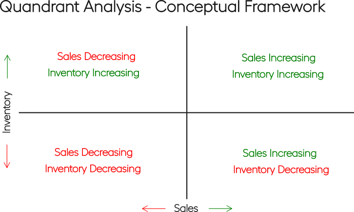
Putting this in words:
- Top right:
- Market balance is weakly tilted towards buyers, as inventory is increasing, but sales are also increasing, meaning there’s still competition among buyers.
- Top left:
- Market balance is strongly tilted towards buyers, as inventory is increasing and sales are decreasing.
- Bottom right:
- Market balance is strongly tilted towards sellers, as inventory is decreasing and sales are increasing.
- Bottom left:
- Market balance is weakly tilted towards sellers, as inventory is decreasing limiting competition amongst sellers, but sales are also decreasing which means competition among buyers isn’t quite as strong.
Given that each quadrant represents a state that favors one party more than another, it follows that as the market state moves towards the center of the quadrant, the interests of buyers versus sellers become more balanced.
For the purposes of this post, we’ll define this centreward movement as “better”, but it’s worth resurfacing that this is not the only possible definition of “better”—it really depends on a person’s frame of reference.
Details, details
In the framework presented above, we used the notion of “increasing” and “decreasing” without defining these terms explicitly, to keep things simple.
But we actually want to plot some data here, so we should be clearer about what these terms mean in this context.
One of the easiest ways to indicate the direction of a trend is to look at the value of a variable of interest today (e.g., sales or inventory) relative to its value a year ago.
This works especially well for data like sales and inventory as both are highly seasonal, so it’s important to compare the same month of data between time periods to check whether things are truly trending up or down.
In this analysis, we’ll use the year-over-year percentage change in sales and inventory to indicate whether these variables are “increasing” or “decreasing” at any given point in time.
And while we could do this analysis by only looking at the market total data, that would make for a pretty boring plot.
We can spice this up a bit by looking at the data for each submarket all on one plot, all at the same time.
Off-balance
Let’s start by taking a trip down memory lane to the winter of 2015.
Despite the cooler temperatures outside, this was a market that was on fire.
At the time, demand seemed insatiable and inventory was the second lowest on record.
Using our handy-dandy quadrant3 framework, we can plot what the balance in each submarket area looked like back then:
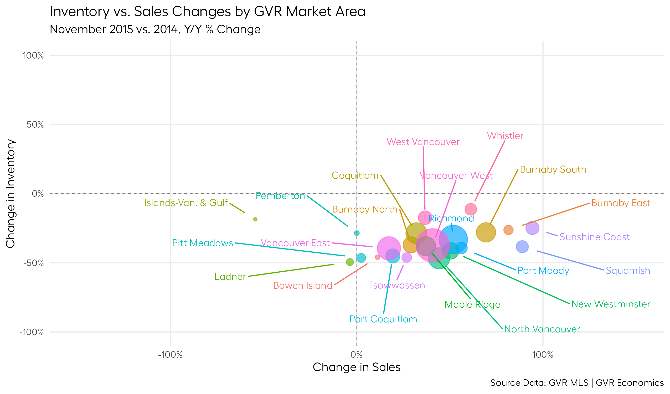
We can see that almost every submarket was favoring sellers, as inventory was declining and sales were increasing, meaning buyers had to compete fiercely with each other, and sellers had a lot of power to set the terms of the sale.
As a result of this imbalance, prices were also rising rapidly and all-cash multiple-offer scenarios were pretty much the norm.
For contrast, let’s look at a period where the market was heavily favoring buyers, such as in the depths of the Great Financial Crisis (2008-ish).
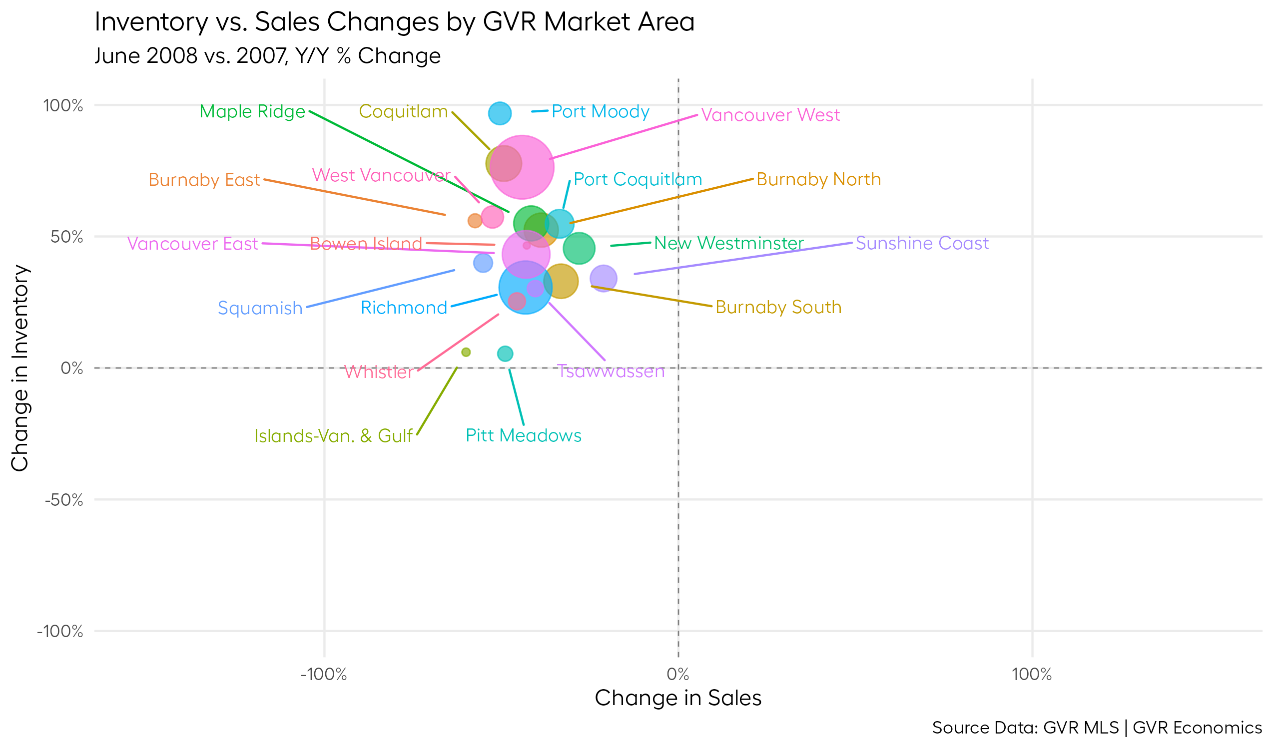
Here, we can see that every single submarket was favoring buyers (some quite heavily), with inventory increasing and sales declining, meaning buyers had a lot of power to set the terms of the sale.
Now that we’ve got a sense of what the market can look like at the extremes, you might naturally be wondering, “where’s the market at today?”
Centre ice
Before we get to answering that question, let’s take a quick look at what the market looked like in April of last year, so we have a reference point to determine whether the market has gotten better (or worse) since then.
Here’s a plot of that:
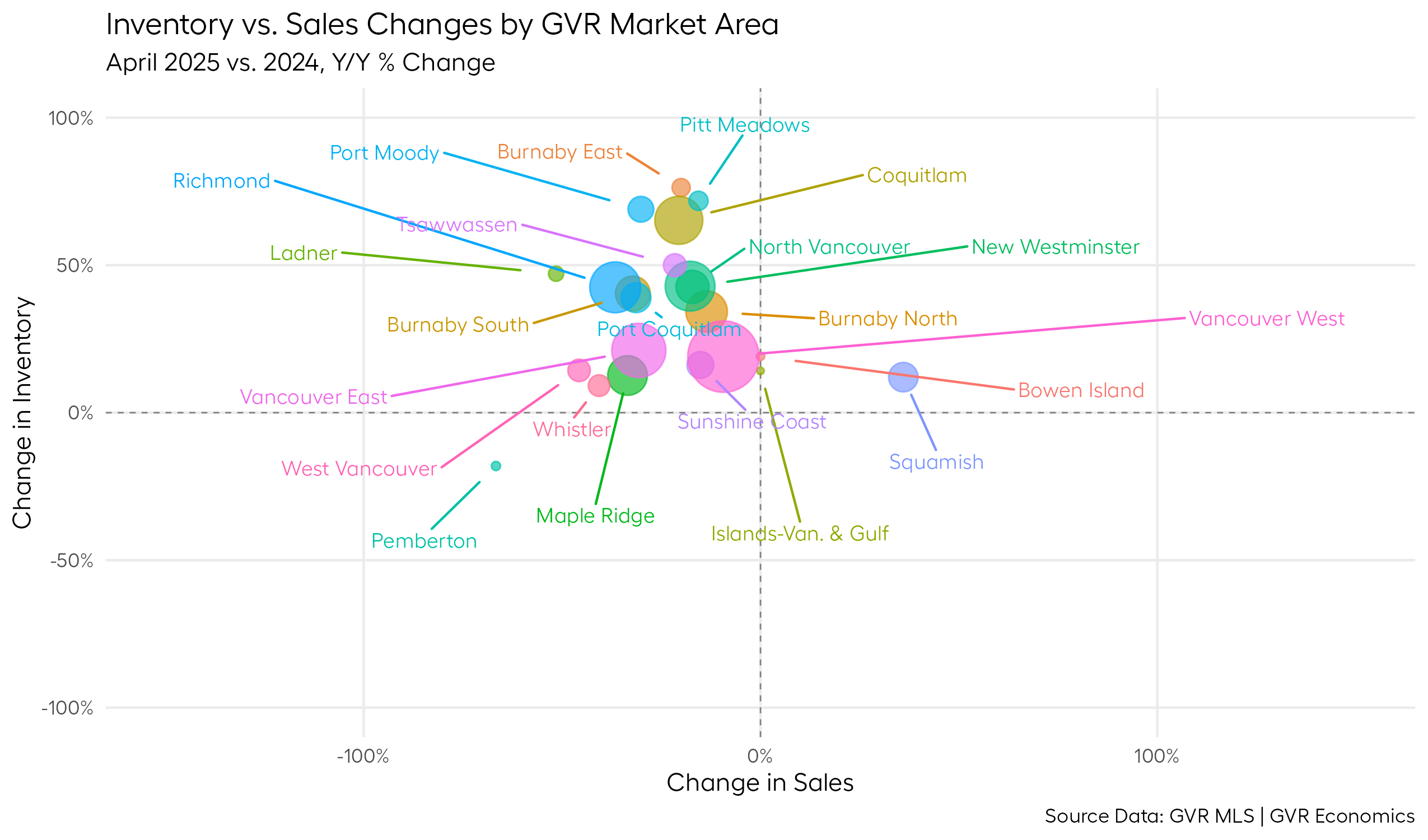
We can see that last year around this time, the market was pretty strongly favoring buyers, with inventory increasing and sales declining in most submarkets.
In some respects, this was a market with quite a few parallels to the market in 2008 we looked at earlier, but the dynamics at play in the global economy were very different (e.g. we had no global financial crisis on our hands – just a wildly unpredictable new U.S. administration).
Now, let’s finally answer the question of whether things have gotten better or worse by taking a look at what the market looks like today:
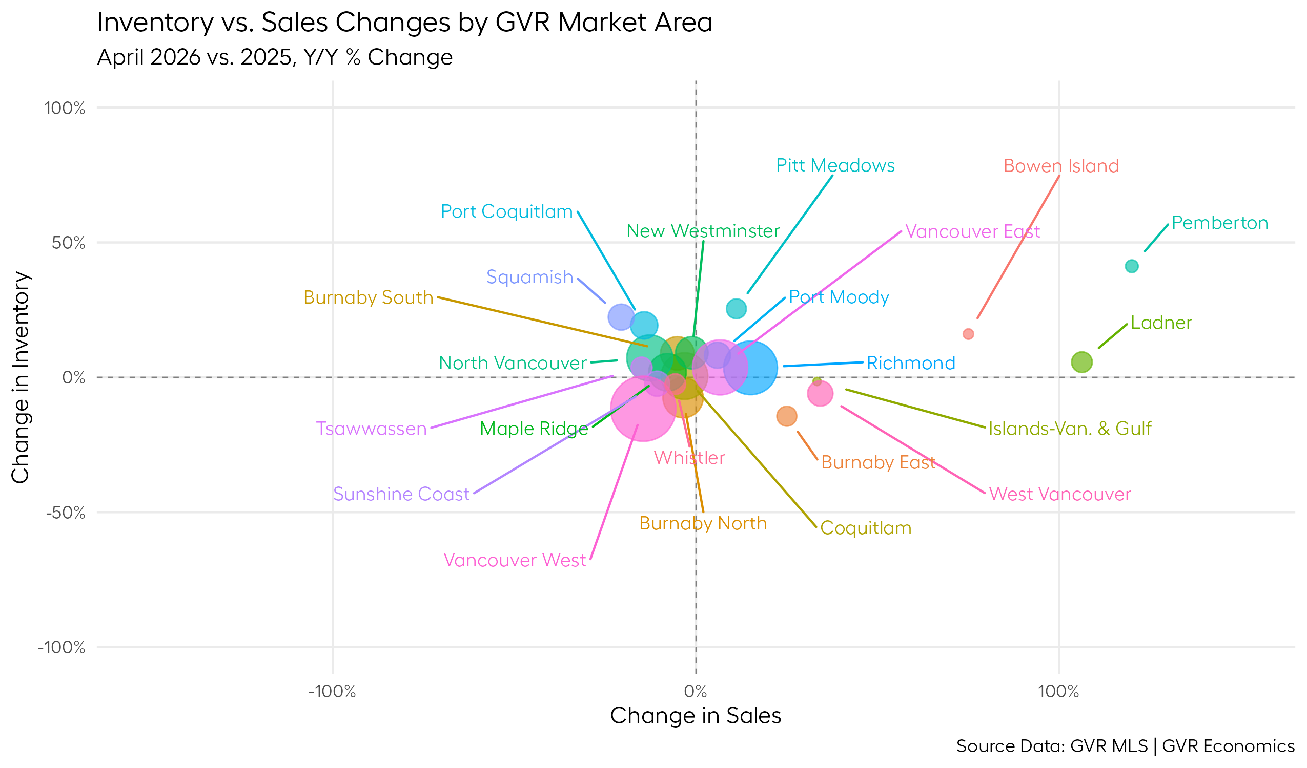
Interesting!!
We can see that the entire market has shifted towards the center of the quadrant, indicating that the market is becoming more balanced.
We can even see a few flyaway submarkets (off to the right) where sales seem to be improving quite markedly relative to last year, but inventory trends are more of a mixed bag for these areas.
Finding my marbles
This centreward movement of the market has been a fairly slow and gradual process, which is why it can sometimes feel like not much is changing.
It’s probably why I was beginning to think I’d lost my marbles in telling the world, “Hey, the market is getting better!”.
It was starting to feel like I was crying wolf.
But I’m glad to report that the data tell a clear story of a market chugging along to a more balanced state.
I think it can objectively be said that the market is getting better, albeit very slowly.
Good to know I still have my marbles.
Bonus plot
When it comes to writing our statistics press releases, it’s often simplest to discuss the market as a whole because it makes for easy/good soundbites.
But it always bothers me that so much of the interesting nuance happening at the submarket level often gets washed away when speaking about the market in aggregate.
It’s extremely difficult to communicate the nuances of each submarket in five-second soundbites, or a couple of quotes in a press release.
So, when I cobbled together this quadrant framework, it felt like one of those cases where a picture really is worth a thousand words.
I found this framework so useful and interesting, I couldn’t resist the temptation to create an animated plot that shows the market moving around the quadrant over time.
If you’re one of those people who enjoys this kind of thing, here’s a neat little bonus plot for you to enjoy:
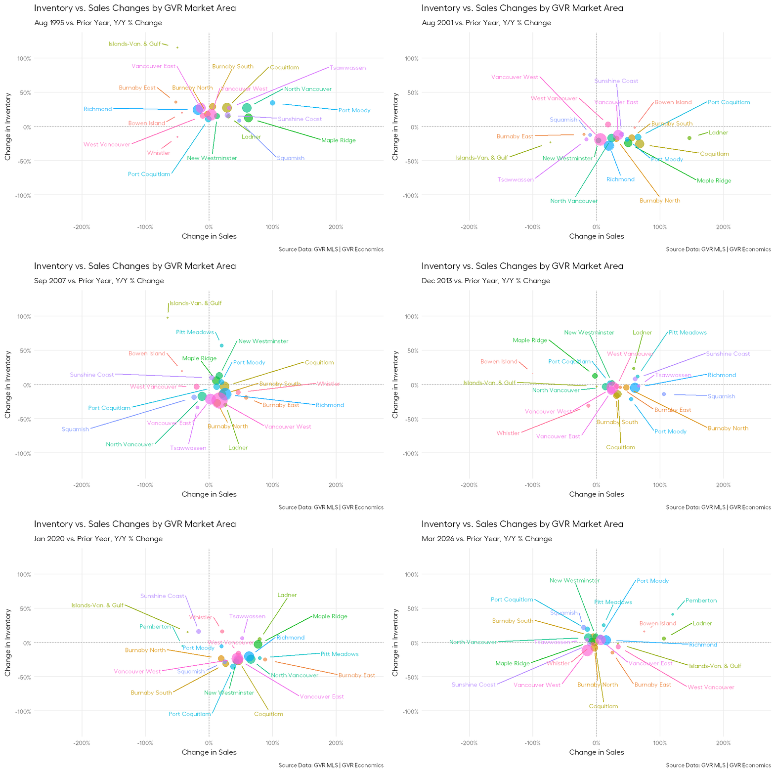
Keep an eye out for the HUGE swings around the Great Financial Crisis (2008-ish) and around the 2020 COVID pandemic. In the case of the latter, the data literally fly off the chart!
Wild!
Footnotes
I’ve been called worse – thanks for the hilarious nickname, Garth. I’ll use that one when introducing myself at parties. Link: https://www.greaterfool.ca/2026/05/05/goldilocks-6/↩︎
Typically, when prices are rising rapidly, it’s because there’s a dearth of inventory and a surge in demand. But this is a double-edged sword as a household that want’s to move is both a buyer and a seller, so what they gain on one end, they typically lose on the other in terms of negotiating power, assuming they’re staying in the same market area. These kinds of market conditions have also been known to bring out the heavy hand of government intervention in the housing market, which is another double-edged sword.↩︎
Note that the size of the bubbles in the plot is proportional to the number of sales in the submarket area. In other words, bigger bubble = bigger market = bigger share of sales total for the overall market. Pay close attention to the biggest bubbles (e.g. Vancouver West, Vancouver East, North Vancouver, Richmond, Coquitlam, etc.) to see how their larger mass can pull the rest of the market around with them.↩︎